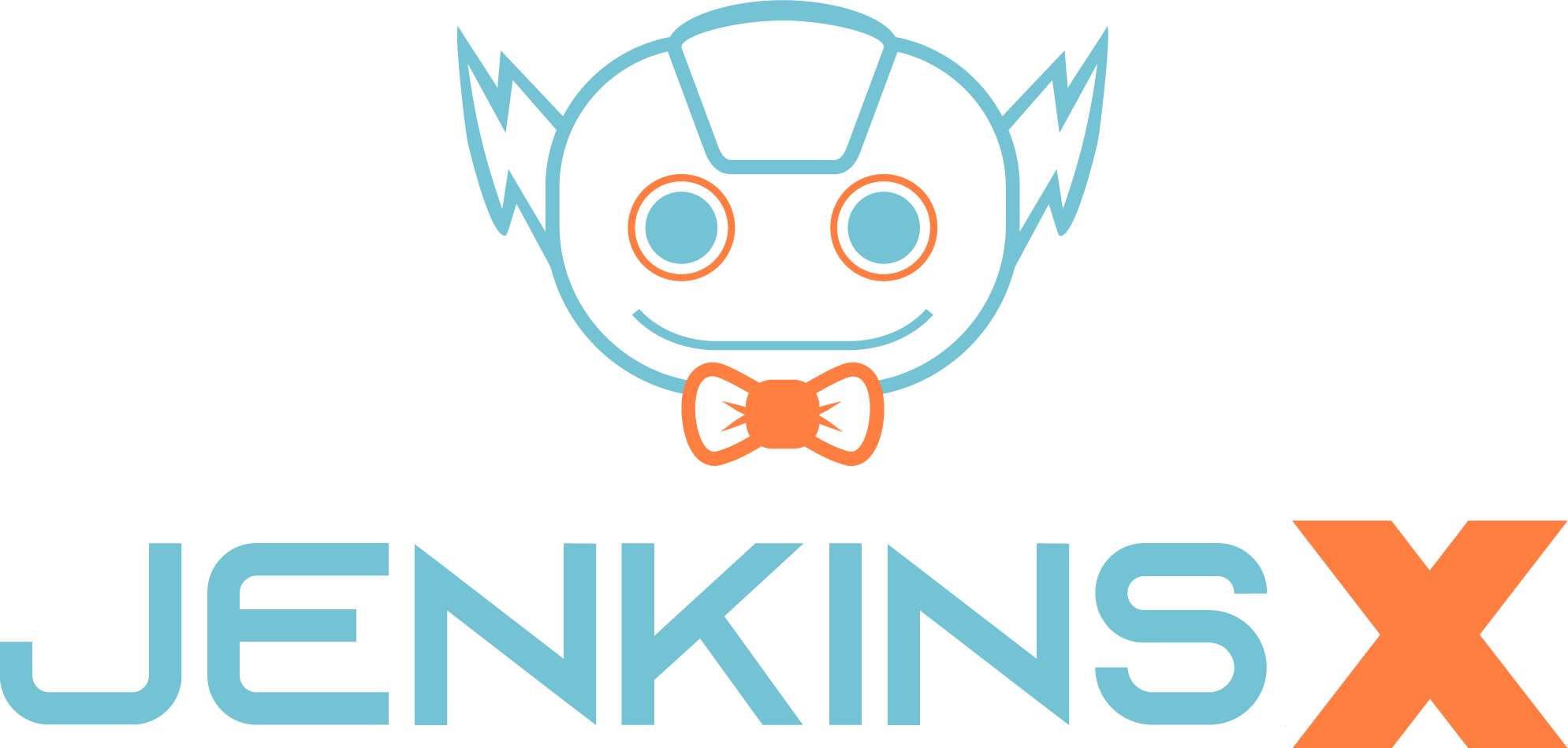
A New Logo for Jenkins X
Back in March 2018, the Jenkins X project burst onto the scene as the Jenkins counterpart for automated CI/CD for Kubernetes. As part of that launch featured the logo: a variation of the Jenkins logo, featuring a pipe-smoking ship captain with Kubernetes logo on his cap.
In software, we like to say that naming is hard - because it is. Another thing that is also hard is trying to capture the essence of a project in a logo. Logos pack a lot of meaning into a small space. Icons, such as the Jenkins logo, establish a strong emotional connection with many developers. So with that in mind we always listened closely to feedback on the new logo and how people perceive the project as a result of it.
Why we are changing the logo
In listening to various types of feedback from all sorts of different sources we heard many positive things but also some problems and confusion were highlighted.
- Not everyone was a fan of the logo and we heard quite a few comments back about aspects that people didn’t like about it, with the ‘pipe-smoking’ featuring high on that list.
- Confusion with Jenkins project - we also saw that the logo was more in keeping with A other Jenkins mascots, which led to confusion about what kind of project Jenkins X is - some perceived it as another plugin in the ecosystem.
- We also heard that use of the Kubernetes logo was confusing or perhaps not completely within the remit of the Kubernetes logo guidelines.
- From a practical perspective we also heard that the logo was too detailed and as a result would not work well as an icon, especially for a favicon. It was seen as more of a mascot than a logo.
With the setup of the CD.Foundation and Jenkins X being one of the founding projects, distinct from Jenkins, we felt the time was right to address this feedback. So we literally went back to the drawing board to think about what logo could better represent Jenkins X as a project. We thought about what we want people to associate with the project: open source, continuous delivery, speed, automation, stability, teams, etc. We also wanted a logo that could improve representation, so we wanted to avoid a human-based logo that might inadvertently encode gender, age and other factors. Additionally, the ‘X’ has become a distinct part of the project’s identity and so we wanted to really emphasize it in the new logo.
Designing the new logo & community feedback
Ultimately we focussed on trying to visualize speed and automation which led to the idea of a robot. However, we still wanted to have a nod to the original Jenkins project featured in the logo somehow or the other. We explicitly decided to not stick with the nautical theme traditionally associated with Kubernetes and related projects. We went through a few iterations, refining and cutting down details as we went. The design effort was a close partnership with Craig Ross, Creative Director at the Linux Foundation and his team, who also produced the CD Foundation, CNCF, Network Service Mesh, and Tekton brands."
After the core Jenkins X team had settled on a design they were happy with, we took it to the community for feedback and to address some of the details. We had alot of feedback, including all the things it reminded folks of (an upside-down koala, Bill Nye, Reddit logo, Flash Gordon, Tekton logo, etc). One overarching consistent theme about the original design was that it did not reflect the friendliness of the community. Kyounger in particular helped analyse this reaction and went the extra mile to propose a solution. We agreed and loved this suggestion and fed this back into the final version of the logo. Thanks alot Kenny & open source FTW!
Jenkins & Jenkins X
Jenkins X started life as a Jenkins subproject and is now an independent project with the Continuous Delivery Foundation (CDF). The bowtie in the new logo is an ever-present reminder of that provenance. Even though our logo and branding may be changing, under the umbrella of the CDF, we continue to work closely with the Jenkins project, sharing that same spirit of service towards developers’ CI/CD and productivity needs.
Rolling out the new logo
We have now started switching over to the new logo and expect to see some new swag available soon too. The old logo we will now consider as a mascot of the Jenkins X project. If you are looking to update your use of the logo, here is the new artwork.

It is a big change for the project but ultimately the reason we put so much time and energy into this is that is important to us we represent the spirit of Jenkins X in everything we do. So when you are using Jenkins X, and you see the new logo, we want you to feel part of the open and friendly community and we want your team to focus on what you really want to focus on: delivering quality software at speed and at any scale.